Showing posts with label Support Library. Show all posts

Wednesday, 22 October 2014

AppCompat v21 — Material Design for Pre-Lollipop Devices!

By Chris Banes, Android Developer Relations


The Android 5.0 SDK was released last Friday, featuring new UI widgets and material design, our visual language focused on good design. To enable you to bring your latest designs to older Android platforms we have expanded our support libraries, including a major update to AppCompat, as well as new RecyclerView, CardView and Palette libraries.


In this post we'll take a look at what’s new in AppCompat and how you can use it to support material design in your apps.


What's new in AppCompat?


AppCompat (aka ActionBarCompat) started out as a backport of the Android 4.0 ActionBar API for devices running on Gingerbread, providing a common API layer on top of the backported implementation and the framework implementation. AppCompat v21 delivers an API and feature-set that is up-to-date with Android 5.0


In this release, Android introduces a new Toolbar widget. This is a generalization of the Action Bar pattern that gives you much more control and flexibility. Toolbar is a view in your hierarchy just like any other, making it easier to interleave with the rest of your views, animate it, and react to scroll events. You can also set it as your Activity’s action bar, meaning that your standard options menu actions will be display within it.


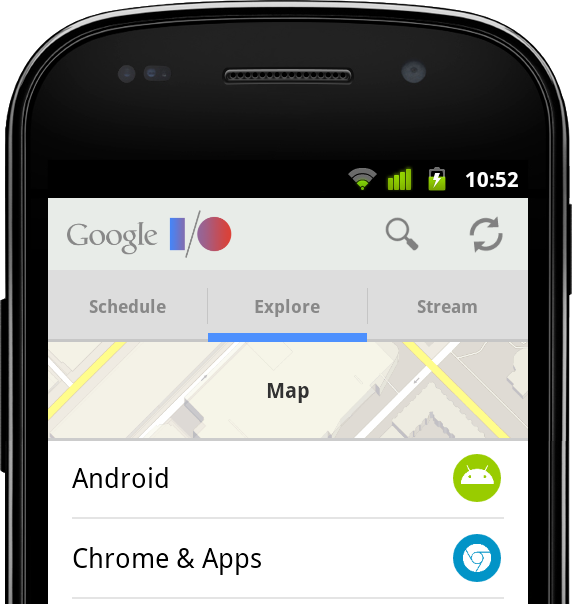
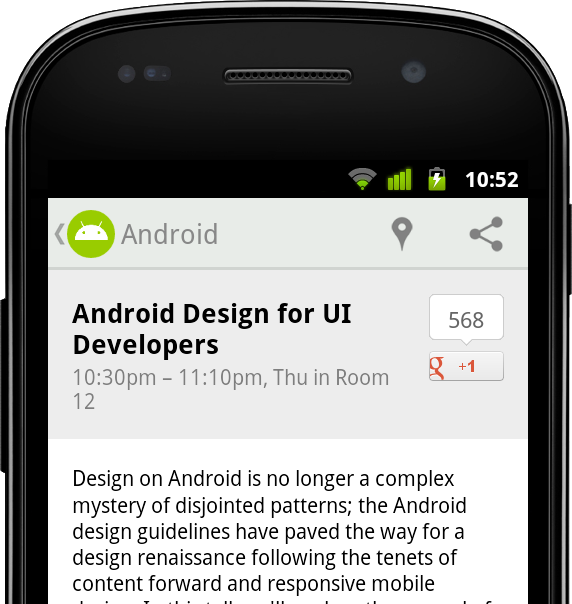
You’ve likely already been using the latest update to AppCompat for a while, it has been included in various Google app updates over the past few weeks, including Play Store and Play Newsstand. It has also been integrated into the Google I/O Android app, pictured above, which is open-source.


Setup


If you’re using Gradle, add appcompat as a dependency in your build.gradle file:


dependencies {
compile "com.android.support:appcompat-v7:21.0.+"
}


New integration


If you are not currently using AppCompat, or you are starting from scratch, here's how to set it up:


  • All of your Activities must extend from ActionBarActivity, which extends from FragmentActivity from the v4 support library, so you can continue to use fragments.

  • All of your themes (that want an Action Bar/Toolbar) must inherit from Theme.AppCompat. There are variants available, including Light and NoActionBar.

  • When inflating anything to be displayed on the action bar (such as a SpinnerAdapter for list navigation in the toolbar), make sure you use the action bar’s themed context, retrieved via getSupportActionBar().getThemedContext().

  • You must use the static methods in MenuItemCompat for any action-related calls on a MenuItem.


For more information, see the Action Bar API guide which is a comprehensive guide on AppCompat.


Migration from previous setup


For most apps, you now only need one theme declaration, in values/:


values/themes.xml:

<style name="Theme.MyTheme" parent="Theme.AppCompat.Light">
<!-- Set AppCompat’s actionBarStyle -->
<item name="actionBarStyle">@style/MyActionBarStyle</item>

<!-- Set AppCompat’s color theming attrs -->
<item name=”colorPrimary”>@color/my_awesome_red</item>
<item name=”colorPrimaryDark”>@color/my_awesome_darker_red</item>

<!-- The rest of your attributes -->
</style>


You can now remove all of your values-v14+ Action Bar styles.


Theming


AppCompat has support for the new color palette theme attributes which allow you to easily customize your theme to fit your brand with primary and accent colors. For example:


values/themes.xml:

<style name="Theme.MyTheme" parent="Theme.AppCompat.Light">
<!-- colorPrimary is used for the default action bar background -->
<item name=”colorPrimary”>@color/my_awesome_color</item>

<!-- colorPrimaryDark is used for the status bar -->
<item name=”colorPrimaryDark”>@color/my_awesome_darker_color</item>

<!-- colorAccent is used as the default value for colorControlActivated,
which is used to tint widgets -->
<item name=”colorAccent”>@color/accent</item>

<!-- You can also set colorControlNormal, colorControlActivated
colorControlHighlight, and colorSwitchThumbNormal. -->

</style>


When you set these attributes, AppCompat automatically propagates their values to the framework attributes on API 21+. This automatically colors the status bar and Overview (Recents) task entry.


On older platforms, AppCompat emulates the color theming where possible. At the moment this is limited to coloring the action bar and some widgets.


Widget tinting


When running on devices with Android 5.0, all of the widgets are tinted using the color theme attributes we just talked about. There are two main features which allow this on Lollipop: drawable tinting, and referencing theme attributes (of the form ?attr/foo) in drawables.


AppCompat provides similar behaviour on earlier versions of Android for a subset of UI widgets:


You don’t need to do anything special to make these work, just use these controls in your layouts as usual and AppCompat will do the rest (with some caveats; see the FAQ below).


Toolbar Widget


Toolbar is fully supported in AppCompat and has feature and API parity with the framework widget. In AppCompat, Toolbar is implemented in the android.support.v7.widget.Toolbar class. There are two ways to use Toolbar:


  • Use a Toolbar as an Action Bar when you want to use the existing Action Bar facilities (such as menu inflation and selection, ActionBarDrawerToggle, and so on) but want to have more control over its appearance.


  • Use a standalone Toolbar when you want to use the pattern in your app for situations that an Action Bar would not support; for example, showing multiple toolbars on the screen, spanning only part of the width, and so on.


Action Bar


To use Toolbar as an Action Bar, first disable the decor-provided Action Bar. The easiest way is to have your theme extend from Theme.AppCompat.NoActionBar (or its light variant).


Second, create a Toolbar instance, usually via your layout XML:


<android.support.v7.widget.Toolbar
android:id=”@+id/my_awesome_toolbar”
android:layout_height=”wrap_content”
android:layout_width=”match_parent”
android:minHeight=”?attr/actionBarSize”
android:background=”?attr/colorPrimary” />


The height, width, background, and so on are totally up to you; these are just good examples. As Toolbar is just a ViewGroup, you can style and position it however you want.


Then in your Activity or Fragment, set the Toolbar to act as your Action Bar:


@Override
public void onCreate(Bundle savedInstanceState) {
super.onCreate(savedInstanceState);
setContentView(R.layout.blah);

Toolbar toolbar = (Toolbar) findViewById(R.id.my_awesome_toolbar);
setSupportActionBar(toolbar);
}


From this point on, all menu items are displayed in your Toolbar, populated via the standard options menu callbacks.


Standalone


The difference in standalone mode is that you do not set the Toolbar to act as your action bar. For this reason, you can use any AppCompat theme and you do not need to disable the decor-provided Action Bar.


In standalone mode, you need to manually populate the Toolbar with content/actions. For instance, if you want it to display actions, you need to inflate a menu into it:


@Override
public void onCreate(Bundle savedInstanceState) {
super.onCreate(savedInstanceState);
setContentView(R.layout.blah);

Toolbar toolbar = (Toolbar) findViewById(R.id.my_awesome_toolbar);

// Set an OnMenuItemClickListener to handle menu item clicks
toolbar.setOnMenuItemClickListener(new Toolbar.OnMenuItemClickListener() {
@Override
public boolean onMenuItemClick(MenuItem item) {
// Handle the menu item
return true;
}
});

// Inflate a menu to be displayed in the toolbar
toolbar.inflateMenu(R.menu.your_toolbar_menu);
}


There are many other things you can do with Toolbar. For more information, see the Toolbar API reference.


Styling


Styling of Toolbar is done differently to the standard action bar, and is set directly onto the view.


Here's a basic style you should be using when you're using a Toolbar as your action bar:


<android.support.v7.widget.Toolbar  
android:layout_height="wrap_content"
android:layout_width="match_parent"
android:minHeight="?attr/actionBarSize"
app:theme="@style/ThemeOverlay.AppCompat.ActionBar" />


The app:theme declaration will make sure that your text and items are using solid colors (i.e 100% opacity white).


DarkActionBar


You can style Toolbar instances directly using layout attributes. To achieve a Toolbar which looks like 'DarkActionBar' (dark content, light overflow menu), provide the theme and popupTheme attributes:


<android.support.v7.widget.Toolbar
android:layout_height=”wrap_content”
android:layout_width=”match_parent”
android:minHeight=”@dimen/triple_height_toolbar”
app:theme="@style/ThemeOverlay.AppCompat.Dark.ActionBar"
app:popupTheme="@style/ThemeOverlay.AppCompat.Light" />


SearchView Widget


AppCompat offers Lollipop’s updated SearchView API, which is far more customizable and styleable (queue the applause). We now use the Lollipop style structure instead of the old searchView* theme attributes.


Here’s how you style SearchView:


values/themes.xml:
<style name=”Theme.MyTheme” parent=”Theme.AppCompat”>
<item name=”searchViewStyle”>@style/MySearchViewStyle</item>
</style>
<style name=”MySearchViewStyle” parent=”Widget.AppCompat.SearchView”>
<!-- Background for the search query section (e.g. EditText) -->
<item name="queryBackground">...</item>
<!-- Background for the actions section (e.g. voice, submit) -->
<item name="submitBackground">...</item>
<!-- Close button icon -->
<item name="closeIcon">...</item>
<!-- Search button icon -->
<item name="searchIcon">...</item>
<!-- Go/commit button icon -->
<item name="goIcon">...</item>
<!-- Voice search button icon -->
<item name="voiceIcon">...</item>
<!-- Commit icon shown in the query suggestion row -->
<item name="commitIcon">...</item>
<!-- Layout for query suggestion rows -->
<item name="suggestionRowLayout">...</item>
</style>


You do not need to set all (or any) of these, the defaults will work for the majority of apps.


Toolbar is coming...


Hopefully this post will help you get up and running with AppCompat and let you create some awesome material apps. Let us know in the comments/G+/Twitter if you’re have questions about AppCompat or any of the support libraries, or where we could provide more documentation.


FAQ


Why is my EditText (or other widget listed above) not being tinted correctly on my pre-Lollipop device?


The widget tinting in AppCompat works by intercepting any layout inflation and inserting a special tint-aware version of the widget in its place. For most people this will work fine, but I can think of a few scenarios where this won’t work, including:


  • You have your own custom version of the widget (i.e. you’ve extended EditText)

  • You are creating the EditText without a LayoutInflater (i.e., calling new EditText()).


The special tint-aware widgets are currently hidden as they’re an unfinished implementation detail. This may change in the future.


Why has X widget not been material-styled when running on pre-Lollipop?


Only some of the most common widgets have been updated so far. There are more coming in future releases of AppCompat.


Why does my Action Bar have a shadow on Android Lollipop? I’ve set android:windowContentOverlay to null.


On Lollipop, the action bar shadow is provided using the new elevation API. To remove it, either call getSupportActionBar().setElevation(0), or set the elevation attribute in your Action Bar style.


Why are there no ripples on pre-Lollipop?


A lot of what allows RippleDrawable to run smoothly is Android 5.0’s new RenderThread. To optimize for performance on previous versions of Android, we've left RippleDrawable out for now.


How do I use AppCompat with Preferences?


You can continue to use PreferenceFragment in your ActionBarActivity when running on an API v11+ device. For devices before that, you will need to provide a normal PreferenceActivity which is not material-styled.




Thursday, 17 July 2014

Porting Your Android Wear Developer Preview Code to the Latest Support Library

Today’s post on #AndroidWear is from +Wayne Piekarski.


Now that the full Android Wear SDK is available, it’s time to port your existing wearable-enabled notification code from the Developer Preview. In the process, you’ll switch to using the latest Android support library, and there are some small API changes that will require you to update your code. This article will show you how to update my previous code samples that were released earlier for stacks and pages, which you can use to guide the conversion of your own code as well.


To get started with an existing project in Android Studio, you should update to the 0.8 or later release. You also need to make sure you’ve downloaded the Google Support Library version 20 or later from the SDK Manager. Since this is only a notification-based example, there’s no need to download the full Android Wear SDK, which is only needed if you want to create an APK to run on the wearable device.


Unix diff output is used to show the necessary changes in an easy to understand way. Do not copy the + or - symbols at the start of each line, and ignore the lines starting with @@ which are used to indicate the line number that changed. For the curious, I used the following command to generate the diff output from the last commit in my GIT repository (the -U1 shows one line of context to keep the output simple):


git show HEAD -U1


Gradle changes


To add the new support-v4 library, you need to edit your build.gradle file like so:


@@ -24,2 +24,3 @@ dependencies {
compile 'com.android.support:appcompat-v7:19.+'
+ compile 'com.android.support:support-v4:20.0+'
}


Make sure you remove the wearable-preview-support.jar that was provided with the Developer Preview from your libs directory and build.gradle file, since these features are now in the standard support library.


Package imports


Since the APIs and package names have changed, the import statements at the top of MainActivity.java need to be adjusted like this:


@@ -7,3 +7,2 @@ import android.view.MenuItem;
-import android.support.v4.app.NotificationCompat;
import android.app.Notification;
@@ -13,4 +12,9 @@ import android.graphics.Bitmap;
import android.graphics.BitmapFactory;
-import android.preview.support.v4.app.NotificationManagerCompat;
-import android.preview.support.wearable.notifications.WearableNotifications;

+import android.support.v4.app.NotificationCompat;
+import android.support.v4.app.NotificationManagerCompat;
+
+// Extra dependencies needed for the pages example
+import java.util.ArrayList;
+import java.util.List;
+import android.support.v4.app.NotificationCompat.BigTextStyle;


Stacking notifications


Since the preview SDK, we have simplified how notifications are implemented. The existing NotificationCompat.Builder() was extended to support groups directly, instead of a separate WearableNotifications class. The steps are a lot simpler, as can be seen with the following changes to showStackNotifications():


@@ -63,3 +67,3 @@ public class MainActivity extends ActionBarActivity {
// Group notification that will be visible on the phone
- NotificationCompat.Builder builderG = new NotificationCompat.Builder(this)
+ Notification summaryNotification = new NotificationCompat.Builder(this)
.setContentTitle("2 Pet Notifications")
@@ -67,5 +71,5 @@ public class MainActivity extends ActionBarActivity {
.setSmallIcon(R.drawable.ic_launcher)
- .setLargeIcon(bitmapMila);
- Notification summaryNotification = new WearableNotifications.Builder(builderG)
- .setGroup(GROUP_KEY_MESSAGES, WearableNotifications.GROUP_ORDER_SUMMARY)

+ .setLargeIcon(bitmapMila)
+ .setGroup(GROUP_KEY_MESSAGES)
+ .setGroupSummary(true)
.build();

@@ -76,3 +80,3 @@ public class MainActivity extends ActionBarActivity {
PendingIntent.getActivity(this, notificationId+1, viewIntent1, 0);
- NotificationCompat.Builder builder1 = new NotificationCompat.Builder(this)
+ Notification notification1 = new NotificationCompat.Builder(this)
.addAction(R.drawable.ic_action_done, "Treat Fed", viewPendingIntent1)
@@ -81,4 +85,3 @@ public class MainActivity extends ActionBarActivity {
+ "Can we have steak?")
- .setSmallIcon(R.drawable.ic_launcher);
- Notification notification1 = new WearableNotifications.Builder(builder1)

+ .setSmallIcon(R.drawable.ic_launcher)
.setGroup(GROUP_KEY_MESSAGES)
@@ -89,3 +92,3 @@ public class MainActivity extends ActionBarActivity {
PendingIntent.getActivity(this, notificationId+2, viewIntent2, 0);
- NotificationCompat.Builder builder2 = new NotificationCompat.Builder(this)
+ Notification notification2 = new NotificationCompat.Builder(this)
.addAction(R.drawable.ic_action_done, "Water Filled", viewPendingIntent2)
@@ -93,4 +96,3 @@ public class MainActivity extends ActionBarActivity {
.setContentText("Can you refill our water bowl?")
- .setSmallIcon(R.drawable.ic_launcher);
- Notification notification2 = new WearableNotifications.Builder(builder2)

+ .setSmallIcon(R.drawable.ic_launcher)
.setGroup(GROUP_KEY_MESSAGES)


Page notifications


Page notifications have also changed to use a WearableExtender() class instead of the WearableNotifications class, as can be seen here in showPageNotifications():


@@ -151,3 +153,3 @@ public class MainActivity extends ActionBarActivity {
PendingIntent.getActivity(this, notificationId+1, viewIntent1, 0);
- NotificationCompat.Builder builder1 = new NotificationCompat.Builder(this)
+ Notification notification1 = new NotificationCompat.Builder(this)
.addAction(R.drawable.ic_action_done, "Returned", viewPendingIntent1)
@@ -155,5 +157,4 @@ public class MainActivity extends ActionBarActivity {
.setContentText("You have " + numOverdue + " books due at the library")
- .setSmallIcon(R.drawable.ic_launcher);
- Notification notification1 = new WearableNotifications.Builder(builder1)
- .addPages(extras)

+ .setSmallIcon(R.drawable.ic_launcher)
+ .extend(new NotificationCompat.WearableExtender().addPages(extras))
.build();


Conclusion


If you want to download the final source code of showStackNotifications() and showPageNotifications(), you can download the MainActivity.java file. You can build this file easily by creating a new project in Android Studio, adding the support library, and then copying in this MainActivity.java.


As you can see, porting this previous code over to the latest Android Wear SDK is really easy! It should take you hardly any time at all to get your experimental applications ported over and ready for publishing on the Google Play!


Wednesday, 18 September 2013

RenderScript in the Android Support Library


Renderscript Support library on devicesstyle="border-radius: 6px;padding:0;margin:0;" />

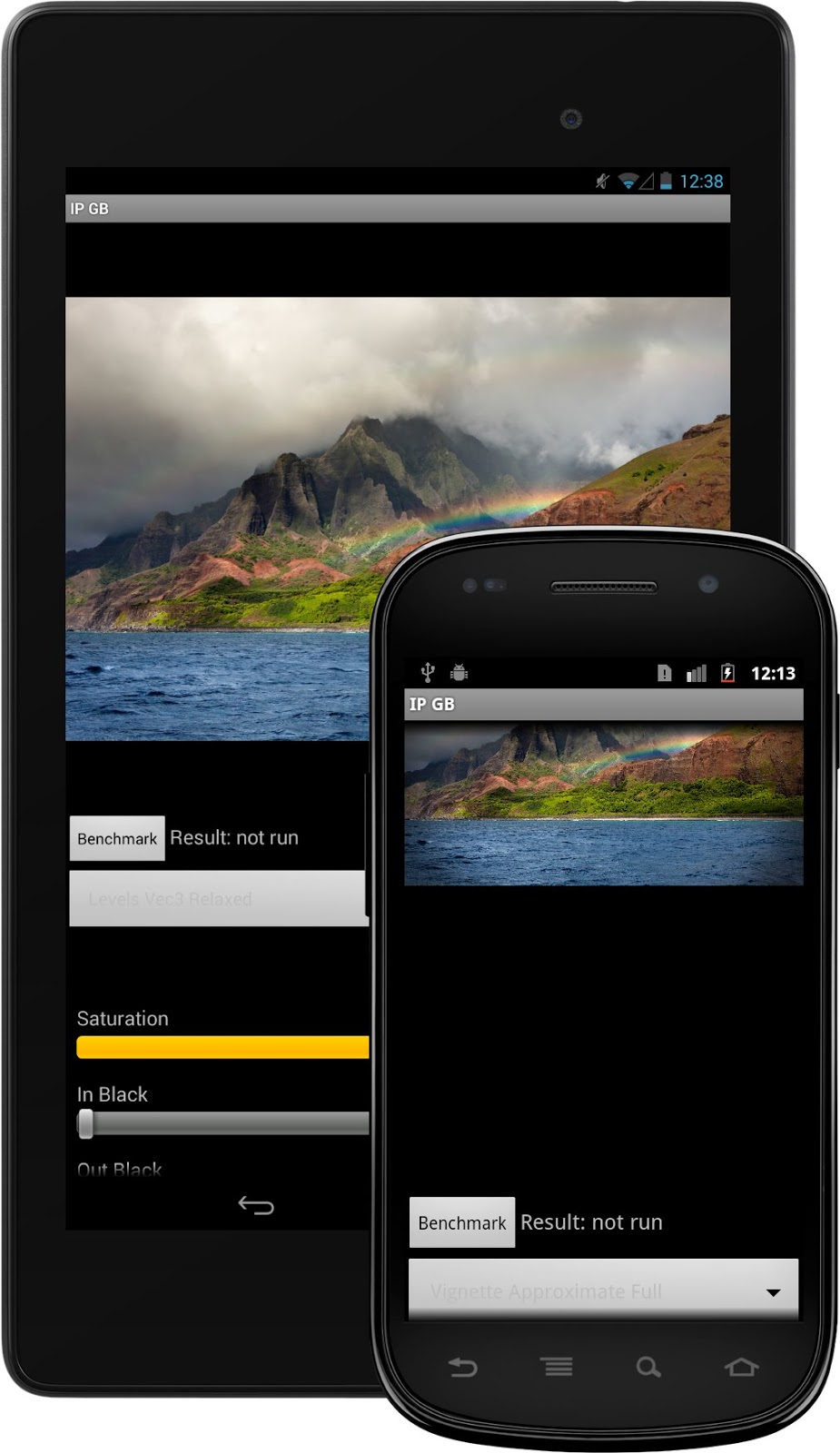
The RenderScript Support Library lets you take advantage of the latest RenderScript features on devices running Android 2.2 and later.


Posted by Tim Murray, Android RenderScript team

One of the requests we hear most commonly from developers is to enable more devices to run the latest features of RenderScript. Over the past several releases of Android, we’ve added a ton of functionality to the RenderScript runtime, but the runtime's dependence on the core Android platform version has limited the range of devices that can support that new functionality. We’ve been working on a solution to this since last year, and we’re now ready to share it with all Android developers.


Today we're announcing a new RenderScript Support Library and updated SDK tools that together let you take advantage of RenderScript on plaform versions all the way back to Android 2.2 (Froyo).

With ADT v22.2, SDK Tools v22.2, and Android Build Tools v18.1.0, apps targeting Android 2.2 and later can now make use of almost all of the functionality available natively in RenderScript with Android 4.3. This includes access to the newest RenderScript features such as high-performance intrinsics and the new performance optimizations available to scripts.


Using the RenderScript Support Library


Using the RenderScript Support Library is straightforward. Once you've updated ADT and your SDK tools, there are only two things that you have to do to start using Renderscript in your apps:


  1. In your classes that use RenderScript, import the RenderScript Support Library from android.support.v8.renderscript. If you are already using native RenderScript, you can change your import from android.renderscript to android.support.v8.renderscript.

    import android.support.v8.renderscript.*;


  2. In your project.properties, make sure you’re targeting android-18 and add the following lines:

    renderscript.target=18
    renderscript.support.mode=true
    sdk.buildtools=18.1.0


That’s it! With the RenderScript Support Library, you can continue to use the same APIs from your app as with the native RenderScript package (with a few minor exceptions that we’ll talk about below), and you can use the same features in your own scripts as you would with the latest RenderScript toolchain.

For complete details on how to set up the RenderScript Support Library, see Accessing RenderScript Java APIs.


API and Implementation details


If you'd like to use RenderScript Support Library in your app, there are few things you should know:


  • First, the RenderScript Support Library supports almost all of the RenderScript API functions as the native API that's available in API level and higher. The one notable exception is that Allocation.USAGE_IO_INPUT and Allocation.USAGE_IO_OUTPUT are not currently available in the RenderScript Support Library.


  • Second, devices running Android 4.2 and earlier will always run their RenderScript applications on the CPU, while devices running Android 4.3 or later will run their RenderScript applications on whatever processors are available on that particular device. Because the Support Library versions of the scripts have to be precompiled to support all possible platforms, there is a performance hit when running the precompiled scripts compared to runtime compilation on Android 4.3 due to more restrictions on compiler optimizations.


We’re really pleased with how the RenderScript Support Library has turned out. We've already seen how it performs in a shipping app — it's been part of the photo editor in the Google+ Android app since May 2013, and it’s definitely proven itself in a large and widely used application. We hope you’ll be happy with it too.


Wednesday, 7 August 2013

ActionBarCompat and I/O 2013 App Source

Posted by Chris Banes, Android Developer Relations


Following on the Android 4.3 and Nexus 7 announcements, we recently released two important tools to help you build beautiful apps that follow Android Design best practices:


  • We released a new backward-compatible Action Bar implementation called ActionBarCompat that's part of the Support Library r18. The ActionBarCompat APIs let you build the essential Action Bar design pattern into your app, with broad compatibility back to Android 2.1.


  • We released the full source code for the I/O 2013 app, which gives you working examples of ActionBarCompat, responsive design for phones and tablets, Google+ sign-in, synchronized data kept fresh through Google Cloud Messaging, livestreaming using the YouTube Android Player API, Google Maps API v2, and much more.
    All of the app code and resources are available for you to browse or download, and it's all licensed under Apache License 2.0/Creative Commons 3.0 BY so you can reuse it in your apps. You can get the source at code.google.com/p/iosched


This post helps you get started with ActionBarCompat, from setting up the Support Library to adding an Action Bar to your UI. If you want to see ActionBarCompat in action first, download the I/O 2013 app from Google Play and give it a try. The app's Action Bar is built using the ActionBarCompat and served as our main test environment for making sure the APIs work properly, with full compatibility across platform versions.


Getting Started with ActionBarCompat


ActionBarCompat is a new API in the Android Support Library that allows you to add an Action Bar to applications targeting minSdkVersion 7 or greater. The API and integration have been designed to closely mirror the existing framework APIs, giving you an easy migration path for your existing apps.


If you've already using another implementation of Action Bar in your app, you can choose whether to ActionBarCompat. If you’re using the old ActionBarCompat sample available through the SDK, then we highly recommend that you upgrade to the new ActionBarCompat API in the Support Library. If you’re using a third-party solution (such as ActionBarSherlock), there are a few reasons to consider upgrading:


ActionBarSherlock is a solid and well-tested library which has served
developers very well for a long time. If you are already using it and do not
currently require any of the above then there is no need to migrate.


If you are ready to get started with ActionBarCompat, the sections below take you through the process.


1. Add ActionBarCompat as a project dependency


ActionBarCompat is distributed as both a Gradle artifact and a library project. See Setting Up the Support Library for more information.


2. Update your style resources


The first thing to update are your Activity themes so they use a Theme.AppCompat theme. If you're currently using one of the Theme.Holo themes then just replace this with the related Theme.AppCompat theme. For instance if you have the following in your AndroidManifest.xml:


<activity
...
android:theme="@android:style/Theme.Holo" />


You would change it to:


<activity
...
android:theme="@style/Theme.AppCompat" />


Things get more tricky when you have a customized theme. The first thing to do is change your base theme to one of the Theme.AppCompat themes, like above.


If you have customized styles for the Action Bar (and related widgets) then you must also change these styles to extend from the Widget.AppCompat version. You also need to double-set each attribute: once in the Android namespace and again with no namespace (the default namespace).


For example, in the following example we have a custom theme which extends from Theme.Holo.Light, which references a custom Action Bar style.


<style name="Theme.Styled" parent="@android:style/Theme.Holo.Light">
<item name="android:actionBarStyle">@style/Widget.Styled.ActionBar</item>
</style>

<style name="Widget.Styled.ActionBar"
parent="@android:style/Widget.Holo.Light.ActionBar">
<item name="android:background">@drawable/ab_custom_solid_styled</item>
<item name="android:backgroundStacked"
>@drawable/ab_custom_stacked_solid_styled</item>
<item name="android:backgroundSplit"
>@drawable/ab_custom_bottom_solid_styled</item>
</style>


To make this work with AppCompat you would move the above styles into the values-v14 folder, modifying each style's parent to be an AppCompat version.


<style name="Theme.Styled" parent="@style/Theme.AppCompat.Light">
<!-- Setting values in the android namespace affects API levels 14+ -->
<item name="android:actionBarStyle">@style/Widget.Styled.ActionBar</item>
</style>

<style name="Widget.Styled.ActionBar" parent="@style/Widget.AppCompat.Light.ActionBar">
<!-- Setting values in the android namespace affects API levels 14+ -->
<item name="android:background">@drawable/ab_custom_solid_styled</item>
<item name="android:backgroundStacked"
>@drawable/ab_custom_stacked_solid_styled</item>
<item name="android:backgroundSplit"
>@drawable/ab_custom_bottom_solid_styled</item>
</style>


You would then need add the following into the values folder:


<style name="Theme.Styled" parent="@style/Theme.AppCompat.Light">
<!-- Setting values in the default namespace affects API levels 7-13 -->
<item name="actionBarStyle">@style/Widget.Styled.ActionBar</item>
</style>

<style name="Widget.Styled.ActionBar" parent="@style/Widget.AppCompat.Light.ActionBar">
<!-- Setting values in the default namespace affects API levels 7-13 -->
<item name="background">@drawable/ab_custom_solid_styled</item>
<item name="backgroundStacked">@drawable/ab_custom_stacked_solid_styled</item>
<item name="backgroundSplit">@drawable/ab_custom_bottom_solid_styled</item>
</style>


3. Modify Menu resources


As with the standard Action Bar in Android 3.0 and later versions, action items are added via the options menu. The difference with ActionBarCompat is that you need to modify your Menu resource files so that any action item attributes come from ActionBarCompat's XML namespace.


In the example below you can see that a new "yourapp" namespace has been added to the menu element, with the showAsAction and actionProviderClass attributes being provided from this namespace. You should also do this for the other action item attributes (actionLayout and actionViewClass) if you use them.


<menu xmlns:yourapp="http://schemas.android.com/apk/res-auto"
xmlns:android="http://schemas.android.com/apk/res/android">

<item
android:id="@+id/menu_share"
android:title="@string/menu_share"
yourapp:actionProviderClass="android.support.v7.widget.ShareActionProvider"
yourapp:showAsAction="always" />
...
</menu>


4. Extend Activity classes from ActionBarCompat


ActionBarCompat contains one Activity class which all of your Activity classes should extend: ActionBarActivity.


This class itself extends from FragmentActivity so you can continue to use Fragments in your application. There is not a ActionBarCompat Fragment class that you need to extend, so you should continue using android.support.v4.Fragment as the base class for your Fragments.


5. Add Menu callbacks


To display items on the Action Bar, you need to populate it by overriding onCreateOptionsMenu() and populating the Menu object. The best way to do this is by inflating a menu resource. If you need to call any MenuItem methods introduced in API level 11 or later, you need to call the shim for that method in MenuItemCompat instead. Here's an example:


@Override
public boolean onCreateOptionsMenu(Menu menu) {
// Inflate the menu
getMenuInflater().inflate(R.menu.main_menu, menu);

// Find the share item
MenuItem shareItem = menu.findItem(R.id.menu_share);

// Need to use MenuItemCompat to retrieve the Action Provider
mActionProvider = (ShareActionProvider)
MenuItemCompat.getActionProvider(shareItem);

return super.onCreateOptionsMenu(menu);
}


6. Retrieve the Action Bar


ActionBarCompat contains it’s own ActionBar class, and to retrieve the Action Bar attached to your activity you call getSupportActionBar(). The API exposed by the compatibility class mirrors that of the framework ActionBar class, allowing you to alter the navigation, show/hide it, and change how it display it’s contents.


7. Add ActionMode callbacks


To start an action mode from your ActionBarActivity simply call startSupportActionMode(), providing a callback similar to how you would with the native action mode. The following example shows how to start an action mode, inflate a menu resource and react to user’s selection:


startSupportActionMode(new ActionMode.Callback() {
@Override
public boolean onCreateActionMode(ActionMode actionMode, Menu menu) {
// Inflate our menu from a resource file
actionMode.getMenuInflater().inflate(R.menu.action_mode_main, menu);

// Return true so that the action mode is shown
return true;
}

@Override
public boolean onPrepareActionMode(ActionMode actionMode, Menu menu) {
// As we do not need to modify the menu before displayed, we return false.
return false;
}

@Override
public boolean onActionItemClicked(ActionMode actionMode, MenuItem menuItem) {
// Similar to menu handling in Activity.onOptionsItemSelected()
switch (menuItem.getItemId()) {
case R.id.menu_remove:
// Some remove functionality
return true;
}

return false;
}

@Override
public void onDestroyActionMode(ActionMode actionMode) {
// Allows you to be notified when the action mode is dismissed
}
});


Similar to the Activity class, ActionBarActivity provides two methods that you can override to be notified when an action mode is started/finished from within your Activity (including attached Fragments). The methods are onSupportActionModeStarted() and onSupportActionModeFinished().


8. Add support for Up navigation


Simple example


Up navigation support is built into ActionBarCompat and is similar to that provided in the Android framework in Android 4.1 and higher.


In the simplest form, you just need add a reference in each AndroidManifest <activity> element to its logical parent activity. This is done by adding a metadata element to the <activity> element. You should also set the android:parentActivityName attribute for explicit Android 4.1 support, although this is not strictly necessary for ActionBarCompat:


<activity android:name=".SampleActivity"
android:parentActivityName=".SampleParentActivity">
<meta-data android:name="android.support.PARENT_ACTIVITY"
android:value=".SampleParentActivity" />
</activity>


In your Activity you should then configure the home button to display for up navigation:


getSupportActionBar().setDisplayHomeAsUpEnabled(true);


When the user now clicks on the home item, the user will navigate up to the parent Activity set in your AndroidManifest.


Advanced calls


There are a number of methods which can be overridden to customize what happens when a user clicks on the home item. Each of the methods below replicate/proxy similarly-named methods added in Android 4.1:


  • onSupportNavigateUp()

  • supportNavigateUpTo(Intent)

  • getSupportParentActivityIntent()

  • supportShouldUpRecreateTask(Intent)

  • onCreateSupportNavigateUpTaskStack(TaskStackBuilder) and onPrepareSupportNavigateUpTaskStack(TaskStackBuilder)


Requesting Window features


When using ActionBarActivity you should call supportRequestWindowFeature() to request window features. For instance the following piece of code requests an overlay action bar:


@Override
protected void onCreate(Bundle savedInstanceState) {
super.onCreate(savedInstanceState);

// Needs to be called before setting the content view
supportRequestWindowFeature(Window.FEATURE_ACTION_BAR_OVERLAY);

// Now set the content view
setContentView(R.layout.activity_main);
...
}


Adding support for ProgressBar


Similar to the native Action Bar, ActionBarCompat supports displaying progress bars on the Action Bar. First you need to request the window feature, you then display or alter the progress bars with one of the following methods, each of which mirror functionality in the similar named method from Activity:


  • setSupportProgress()

  • setSupportProgressBarIndeterminate()

  • setSupportProgressBarVisibility()

  • setSupportProgressBarIndeterminateVisibility()


Below is an example which requests an indeterminate progress bar, and then later displays it:


@Override
protected void onCreate(Bundle savedInstanceState) {
super.onCreate(savedInstanceState);

// Needs to be called before setting the content view
supportRequestWindowFeature(Window.FEATURE_INDETERMINATE_PROGRESS);

// Now set the content view
setContentView(R.layout.activity_main);
...
// When ready, show the indeterminate progress bar
setSupportProgressBarIndeterminateVisibility(true);
}


Further Reading


The Action Bar API Guide covers a lot of what is in this post and much more. Even if you have used the Action Bar API in the past, it’s definitely worth reading to see how ActionBarCompat differs from the framework.


There are also a number of sample applications using ActionBarCompat covering how to use the library in various ways. You can find them in the “Samples for SDK” package in the SDK Manager.


Check out the video below for a quick hands-on with ActionBarCompat.


Followers